
Money Mirror:
Turning financial anxiety into self-awareness
Role:
Project type:
Timeline:
Platform:
UX Research and Design
Academic project (3 members)
2 weeks
iOS, vibe-coded
Fintech Journaling App
Overview
Money Mirror is a reflective fintech journaling app that lets users log not just what they spent, but how they were feeling when they spent it.
It replaces the judgment-heavy patterns of traditional budgeting tools with a calm interface designed to meet users exactly where they are emotionally.
The Challenge
Money decisions are rarely purely rational.
Most people don't overspend because they're irresponsible. They overspend because they're human. A stressful afternoon at work, a friend's vacation appearing in your feed, a slow Sunday — these moments quietly trigger purchases that have nothing to do with actual need.
The cycle looks predictable once you see it: payday arrives, there's a brief sense of control, comfort spending slowly chips away at it, and by the end of the week the banking app stays closed because facing the numbers feels like confronting something they can't quite name yet.
Existing fintech tools make this worse. Alert thresholds, over-budget notifications, red numbers — all of it lands as correction at the exact moment a person is least available to receive it. Brené Brown's research makes clear that this kind of corrective pressure corrodes the very part of us that believes we are capable of change (Brown, 2012). Every warning notification in a fintech app introduces that corrosion at peak vulnerability. We wanted to build something that interrupted the cycle without adding to it.

Why It Matters
As per the 2024 Discover Personal Loans survey, and a separate Capital One study.
80%
Americans report anxiety about their financial situation
~1/2
of all social media users have impulsively purchased something by seeing in a feed
67%
GenZ report feeling financially stressed more than three days a week
68%
regret at least one of those purchases
The Core Problem
How might we help people who overspend emotionally understand the feeling behind the purchase, without making them feel worse about it?
The Solution
Money Mirror follows a user through the full emotional arc of a pay cycle and offers a low-pressure touchpoint at each phase rather than a warning. A spend-type selector distinguishes essential purchases from emotional ones, because rent should never be treated the same way as a stress-buy. For emotional spending, three questions unfold: how were you feeling, what was going on, and did it help? No receipt required, no category assignment, no budget score. Over time, the Insights screen surfaces patterns in plain language and places the user's earliest and most recent entries side by side, so growth is visible in their own words.

Understanding Who We're Designing for
Before wireframing a single screen, we built four affective personas
to map the emotional landscape of financial anxiety across different combinations of financial literacy and financial means.
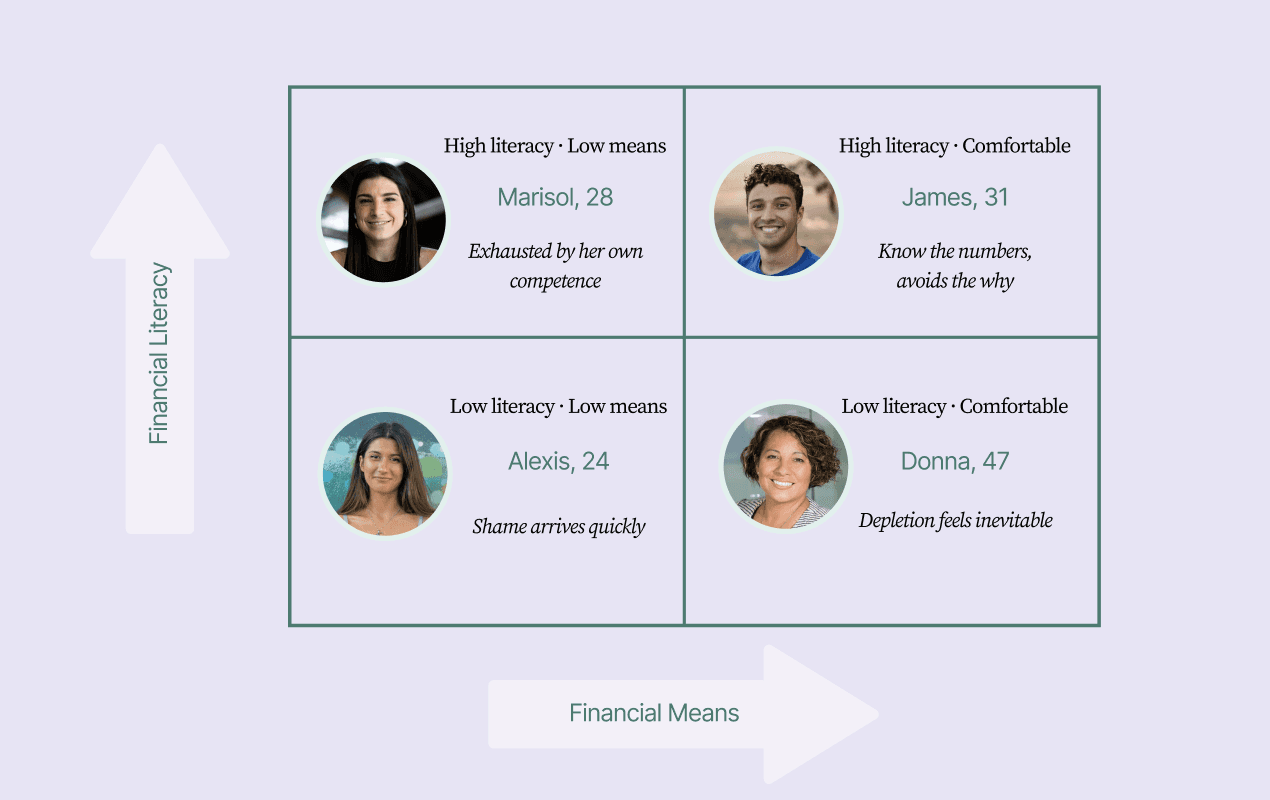
Alexis is the one we anchored most of our design around.

Mapping the Emotional Journey
We anchored the journey map in Alexis's week, because she represents the most common user: someone navigating ordinary pressures, reaching for small comforts, and quietly resetting before anyone notices — including herself.
The map traces six emotional phases from payday through avoidance, with a designed app touchpoint at each one. A few that shaped the prototype most:

The Prototype: Iteration 1
We built a seven-screen interactive mobile prototype organized around the emotional journey map. The palette did the heavy lifting before any feature was encountered: warm parchment backgrounds, serif typefaces for emotionally weighted content, and a soft lavender and sage system signaling this was a reflective space, not a transactional one. No red, anywhere.
Payday Intention
Setting
Intercepts the brief sense of possibility that comes with getting paid, before habitual spending begins. Rather than routing into a budget breakdown, it asks one question: what would feel good to protect this money for? Quick-tap chips fill a free-text field the user can edit freely.


Log a Purchase
The core of the product. A spend-type selector opens the screen: Essential, Emotional, or Not sure. Essential purchases get a quiet acknowledgment and nothing more. Rent is never treated the same way as a stress-buy. For emotional purchases, three questions unfold: how were you feeling (emoji row), what was going on (toggleable mood chips plus free text), and did it help? That last question doesn't ask whether the purchase was wise. It asks whether it served the actual need the user had.


Entries
Separates emotional and essential purchases into distinct tabs so reviewing emotional spending never requires scrolling past rent. Within the emotional tab, users can search by mood tag or category, so typing "tired" surfaces every purchase logged under that state.


Insights
Translates repeated entries into plain-language patterns. A mood-colored bar chart shows spending by day, with each segment coded by the emotion logged at the time. A short text summary names the pattern directly. A look-back moment at the bottom places the user's first and most recent journal entries side by side, making change visible in their own words rather than through a score.

Home Dashboard
Shows only what matters, in order of emotional relevance: an intention banner from payday, a one-line pattern nudge, an Essential and Emotional expense split as two tappable cards, a month-on-month comparison, the most recent entry, and the look-back teaser. No spending graphs, no net worth tracker, no red warning states.

User Testing
We tested the first prototype with five people and structured each session around Norman's visceral, behavioral, and reflective (VBR) framework, because the prototype needed to work emotionally, not just functionally. Participants ranged from budget-curious first-jobbers to people who already tracked their spending in spreadsheets, giving us a spread that roughly mapped to our persona range.

We tested the first prototype with five people and structured each session around Norman's visceral, behavioral, and reflective (VBR) framework, because the prototype needed to work emotionally, not just functionally. Participants ranged from budget-curious first-jobbers to people who already tracked their spending in spreadsheets, giving us a spread that roughly mapped to our persona range.
Second Iteration and Design Implications
The second prototype was vibecoded, with the testing patterns guiding each decision in real time.
The welcome screen was rewritten with clearer, benefit-led language, removing abstract phrasing that created friction on first encounter.

Intention-setting was expanded to multi-select, acknowledging that financial motivation is rarely one thing at a time.

The emotional logging flow gained a custom emoji add field, lowering the bar for reflection without requiring perfect emotional vocabulary to begin.


The essential/emotional distinction was preserved in full — it was the most validated structural decision — but supporting copy was tightened so the difference lands immediately without reading effort.

The Insights screen was reordered so the weekly emotional pattern summary leads and the chart-heavy data follows below. Leading with meaning and supporting with detail matched how users actually engaged with it.

The home screen now shows more entries and reorganizes the monthly shift card into a clearer before-and-after format, making personal change feel cumulative rather than isolated to a single moment.

My Takeaways
Emotional safety before analytical depth.
Users wanted more data, more customization, more depth — but only after they felt safe. Most fintech products get this order backwards.
One reframe does more than a whole feature
Asking "did it help?" instead of "was this in budget?" shifted the entire experience. The most impactful design decisions in this project were editorial, not structural.
Order matters as much as content
The journey map taught us that same information lands completely differently depending on where in the emotional cycle it arrives. Timing the touchpoint is as important as designing it.
Next Steps
Non-purchase log — a way for users like Marisol and Donna to record emotional financial moments that aren't transactions: money sent home, choosing not to buy something for yourself, invisible care labor absorbed alone.
Adaptive prompts — reflection questions that grow in depth and nuance for users like James, who engage more honestly once trust is established over time.
Longitudinal pilot — test whether the emotional shift observed in a single session holds over weeks of real use, and whether logging behavior changes spending behavior at all.
More Work
Money Mirror:
Turning financial anxiety into self-awareness
Role:
Project type:
Timeline:
Platform:
UX Research and Design
Academic project (3 members)
2 weeks
iOS, vibe-coded
Fintech Journaling App
Overview
Money Mirror is a reflective fintech journaling app that lets users log not just what they spent, but how they were feeling when they spent it.
It replaces the judgment-heavy patterns of traditional budgeting tools with a calm interface designed to meet users exactly where they are emotionally.
The Challenge
Money decisions are rarely purely rational.
Most people don't overspend because they're irresponsible. They overspend because they're human. A stressful afternoon at work, a friend's vacation appearing in your feed, a slow Sunday — these moments quietly trigger purchases that have nothing to do with actual need.
The cycle looks predictable once you see it: payday arrives, there's a brief sense of control, comfort spending slowly chips away at it, and by the end of the week the banking app stays closed because facing the numbers feels like confronting something they can't quite name yet.
Existing fintech tools make this worse. Alert thresholds, over-budget notifications, red numbers — all of it lands as correction at the exact moment a person is least available to receive it. Brené Brown's research makes clear that this kind of corrective pressure corrodes the very part of us that believes we are capable of change (Brown, 2012). Every warning notification in a fintech app introduces that corrosion at peak vulnerability. We wanted to build something that interrupted the cycle without adding to it.
Why It Matters
As per the 2024 Discover Personal Loans survey, and a separate Capital One study.
80%
Americans report anxiety about their financial situation
~1/2
of all social media users have impulsively purchased something by seeing in a feed
67%
GenZ report feeling financially stressed more than three days a week
68%
regret at least one of those purchases
The Core Problem
How might we help people who overspend emotionally understand the feeling behind the purchase, without making them feel worse about it?
The Solution
Money Mirror follows a user through the full emotional arc of a pay cycle and offers a low-pressure touchpoint at each phase rather than a warning. A spend-type selector distinguishes essential purchases from emotional ones, because rent should never be treated the same way as a stress-buy. For emotional spending, three questions unfold: how were you feeling, what was going on, and did it help? No receipt required, no category assignment, no budget score. Over time, the Insights screen surfaces patterns in plain language and places the user's earliest and most recent entries side by side, so growth is visible in their own words.
Understanding Who We're Designing for
Before wireframing a single screen, we built four affective personas
to map the emotional landscape of financial anxiety across different combinations of financial literacy and financial means.
Alexis is the one we anchored most of our design around.
Mapping the Emotional Journey
We anchored the journey map in Alexis's week, because she represents the most common user: someone navigating ordinary pressures, reaching for small comforts, and quietly resetting before anyone notices — including herself.
The map traces six emotional phases from payday through avoidance, with a designed app touchpoint at each one. A few that shaped the prototype most:
The Prototype: Iteration 1
We built a seven-screen interactive mobile prototype organized around the emotional journey map. The palette did the heavy lifting before any feature was encountered: warm parchment backgrounds, serif typefaces for emotionally weighted content, and a soft lavender and sage system signaling this was a reflective space, not a transactional one. No red, anywhere.
Payday Intention Setting
Intercepts the brief sense of possibility that comes with getting paid, before habitual spending begins. Rather than routing into a budget breakdown, it asks one question: what would feel good to protect this money for? Quick-tap chips fill a free-text field the user can edit freely.
Log a Purchase
The core of the product. A spend-type selector opens the screen: Essential, Emotional, or Not sure. Essential purchases get a quiet acknowledgment and nothing more. Rent is never treated the same way as a stress-buy. For emotional purchases, three questions unfold: how were you feeling (emoji row), what was going on (toggleable mood chips plus free text), and did it help? That last question doesn't ask whether the purchase was wise. It asks whether it served the actual need the user had.
Entries
Separates emotional and essential purchases into distinct tabs so reviewing emotional spending never requires scrolling past rent. Within the emotional tab, users can search by mood tag or category, so typing "tired" surfaces every purchase logged under that state.
Insights
Translates repeated entries into plain-language patterns. A mood-colored bar chart shows spending by day, with each segment coded by the emotion logged at the time. A short text summary names the pattern directly. A look-back moment at the bottom places the user's first and most recent journal entries side by side, making change visible in their own words rather than through a score.
Home Dashboard
Shows only what matters, in order of emotional relevance: an intention banner from payday, a one-line pattern nudge, an Essential and Emotional expense split as two tappable cards, a month-on-month comparison, the most recent entry, and the look-back teaser. No spending graphs, no net worth tracker, no red warning states.
User Testing
We tested the first prototype with five people and structured each session around Norman's visceral, behavioral, and reflective (VBR) framework, because the prototype needed to work emotionally, not just functionally. Participants ranged from budget-curious first-jobbers to people who already tracked their spending in spreadsheets, giving us a spread that roughly mapped to our persona range.
We tested the first prototype with five people and structured each session around Norman's visceral, behavioral, and reflective (VBR) framework, because the prototype needed to work emotionally, not just functionally. Participants ranged from budget-curious first-jobbers to people who already tracked their spending in spreadsheets, giving us a spread that roughly mapped to our persona range.
Second Iteration and Design Implications
The second prototype was vibecoded, with the testing patterns guiding each decision in real time.
The welcome screen was rewritten with clearer, benefit-led language, removing abstract phrasing that created friction on first encounter.
Intention-setting was expanded to multi-select, acknowledging that financial motivation is rarely one thing at a time.
The emotional logging flow gained a custom emoji add field, lowering the bar for reflection without requiring perfect emotional vocabulary to begin.
The essential/emotional distinction was preserved in full — it was the most validated structural decision — but supporting copy was tightened so the difference lands immediately without reading effort.
The Insights screen was reordered so the weekly emotional pattern summary leads and the chart-heavy data follows below. Leading with meaning and supporting with detail matched how users actually engaged with it.
The home screen now shows more entries and reorganizes the monthly shift card into a clearer before-and-after format, making personal change feel cumulative rather than isolated to a single moment.
My Takeaways
Emotional safety before analytical depth.
Users wanted more data, more customization, more depth — but only after they felt safe. Most fintech products get this order backwards.
One reframe does more than a whole feature
Asking "did it help?" instead of "was this in budget?" shifted the entire experience. The most impactful design decisions in this project were editorial, not structural.
Order matters as much as content
The journey map taught us that same information lands completely differently depending on where in the emotional cycle it arrives. Timing the touchpoint is as important as designing it.
Next Steps
Non-purchase log — a way for users like Marisol and Donna to record emotional financial moments that aren't transactions: money sent home, choosing not to buy something for yourself, invisible care labor absorbed alone.
Adaptive prompts — reflection questions that grow in depth and nuance for users like James, who engage more honestly once trust is established over time.
Longitudinal pilot — test whether the emotional shift observed in a single session holds over weeks of real use, and whether logging behavior changes spending behavior at all.
More Work
Money Mirror:
Turning financial anxiety into self-awareness
Role:
Project type:
Timeline:
Platform:
UX Research and Design
Academic project (3 members)
2 weeks
iOS, vibe-coded
Fintech Journaling App
Overview
Money Mirror is a reflective fintech journaling app that lets users log not just what they spent, but how they were feeling when they spent it.
It replaces the judgment-heavy patterns of traditional budgeting tools with a calm interface designed to meet users exactly where they are emotionally.
The Challenge
Money decisions are rarely purely rational.
Most people don't overspend because they're irresponsible. They overspend because they're human. A stressful afternoon at work, a friend's vacation appearing in your feed, a slow Sunday — these moments quietly trigger purchases that have nothing to do with actual need.
The cycle looks predictable once you see it: payday arrives, there's a brief sense of control, comfort spending slowly chips away at it, and by the end of the week the banking app stays closed because facing the numbers feels like confronting something they can't quite name yet.
Existing fintech tools make this worse. Alert thresholds, over-budget notifications, red numbers — all of it lands as correction at the exact moment a person is least available to receive it. Brené Brown's research makes clear that this kind of corrective pressure corrodes the very part of us that believes we are capable of change (Brown, 2012). Every warning notification in a fintech app introduces that corrosion at peak vulnerability. We wanted to build something that interrupted the cycle without adding to it.
Why It Matters
As per the 2024 Discover Personal Loans survey, and a separate Capital One study.
80%
Americans report anxiety about their financial situation
~1/2
of all social media users have impulsively purchased something by seeing in a feed
67%
GenZ report feeling financially stressed more than three days a week
68%
regret at least one of those purchases
The Core Problem
How might we help people who overspend emotionally understand the feeling behind the purchase, without making them feel worse about it?
The Solution
Money Mirror follows a user through the full emotional arc of a pay cycle and offers a low-pressure touchpoint at each phase rather than a warning. A spend-type selector distinguishes essential purchases from emotional ones, because rent should never be treated the same way as a stress-buy. For emotional spending, three questions unfold: how were you feeling, what was going on, and did it help? No receipt required, no category assignment, no budget score. Over time, the Insights screen surfaces patterns in plain language and places the user's earliest and most recent entries side by side, so growth is visible in their own words.
Understanding Who We're Designing for
Before wireframing a single screen, we built four affective personas
to map the emotional landscape of financial anxiety across different combinations of financial literacy and financial means.
Alexis is the one we anchored most of our design around.
Mapping the Emotional Journey
We anchored the journey map in Alexis's week, because she represents the most common user: someone navigating ordinary pressures, reaching for small comforts, and quietly resetting before anyone notices — including herself.
The map traces six emotional phases from payday through avoidance, with a designed app touchpoint at each one. A few that shaped the prototype most:
The Prototype: Iteration 1
We built a seven-screen interactive mobile prototype organized around the emotional journey map. The palette did the heavy lifting before any feature was encountered: warm parchment backgrounds, serif typefaces for emotionally weighted content, and a soft lavender and sage system signaling this was a reflective space, not a transactional one. No red, anywhere.
Payday Intention
Setting
Intercepts the brief sense of possibility that comes with getting paid, before habitual spending begins. Rather than routing into a budget breakdown, it asks one question: what would feel good to protect this money for? Quick-tap chips fill a free-text field the user can edit freely.
Log a Purchase
The core of the product. A spend-type selector opens the screen: Essential, Emotional, or Not sure. Essential purchases get a quiet acknowledgment and nothing more. Rent is never treated the same way as a stress-buy. For emotional purchases, three questions unfold: how were you feeling (emoji row), what was going on (toggleable mood chips plus free text), and did it help? That last question doesn't ask whether the purchase was wise. It asks whether it served the actual need the user had.
Entries
Separates emotional and essential purchases into distinct tabs so reviewing emotional spending never requires scrolling past rent. Within the emotional tab, users can search by mood tag or category, so typing "tired" surfaces every purchase logged under that state.
Insights
Translates repeated entries into plain-language patterns. A mood-colored bar chart shows spending by day, with each segment coded by the emotion logged at the time. A short text summary names the pattern directly. A look-back moment at the bottom places the user's first and most recent journal entries side by side, making change visible in their own words rather than through a score.
Home Dashboard
Shows only what matters, in order of emotional relevance: an intention banner from payday, a one-line pattern nudge, an Essential and Emotional expense split as two tappable cards, a month-on-month comparison, the most recent entry, and the look-back teaser. No spending graphs, no net worth tracker, no red warning states.
User Testing
We tested the first prototype with five people and structured each session around Norman's visceral, behavioral, and reflective (VBR) framework, because the prototype needed to work emotionally, not just functionally. Participants ranged from budget-curious first-jobbers to people who already tracked their spending in spreadsheets, giving us a spread that roughly mapped to our persona range.
We tested the first prototype with five people and structured each session around Norman's visceral, behavioral, and reflective (VBR) framework, because the prototype needed to work emotionally, not just functionally. Participants ranged from budget-curious first-jobbers to people who already tracked their spending in spreadsheets, giving us a spread that roughly mapped to our persona range.
Second Iteration and Design Implications
The second prototype was vibecoded, with the testing patterns guiding each decision in real time.
The welcome screen was rewritten with clearer, benefit-led language, removing abstract phrasing that created friction on first encounter.
Intention-setting was expanded to multi-select, acknowledging that financial motivation is rarely one thing at a time.
The emotional logging flow gained a custom emoji add field, lowering the bar for reflection without requiring perfect emotional vocabulary to begin.
The essential/emotional distinction was preserved in full — it was the most validated structural decision — but supporting copy was tightened so the difference lands immediately without reading effort.
The Insights screen was reordered so the weekly emotional pattern summary leads and the chart-heavy data follows below. Leading with meaning and supporting with detail matched how users actually engaged with it.
The home screen now shows more entries and reorganizes the monthly shift card into a clearer before-and-after format, making personal change feel cumulative rather than isolated to a single moment.
My Takeaways
Emotional safety before analytical depth.
Users wanted more data, more customization, more depth — but only after they felt safe. Most fintech products get this order backwards.
One reframe does more than a whole feature
Asking "did it help?" instead of "was this in budget?" shifted the entire experience. The most impactful design decisions in this project were editorial, not structural.
Order matters as much as content
The journey map taught us that same information lands completely differently depending on where in the emotional cycle it arrives. Timing the touchpoint is as important as designing it.
Next Steps
Non-purchase log — a way for users like Marisol and Donna to record emotional financial moments that aren't transactions: money sent home, choosing not to buy something for yourself, invisible care labor absorbed alone.
Adaptive prompts — reflection questions that grow in depth and nuance for users like James, who engage more honestly once trust is established over time.
Longitudinal pilot — test whether the emotional shift observed in a single session holds over weeks of real use, and whether logging behavior changes spending behavior at all.
More Work